UX Case - New feature design for a food delivery mobile app
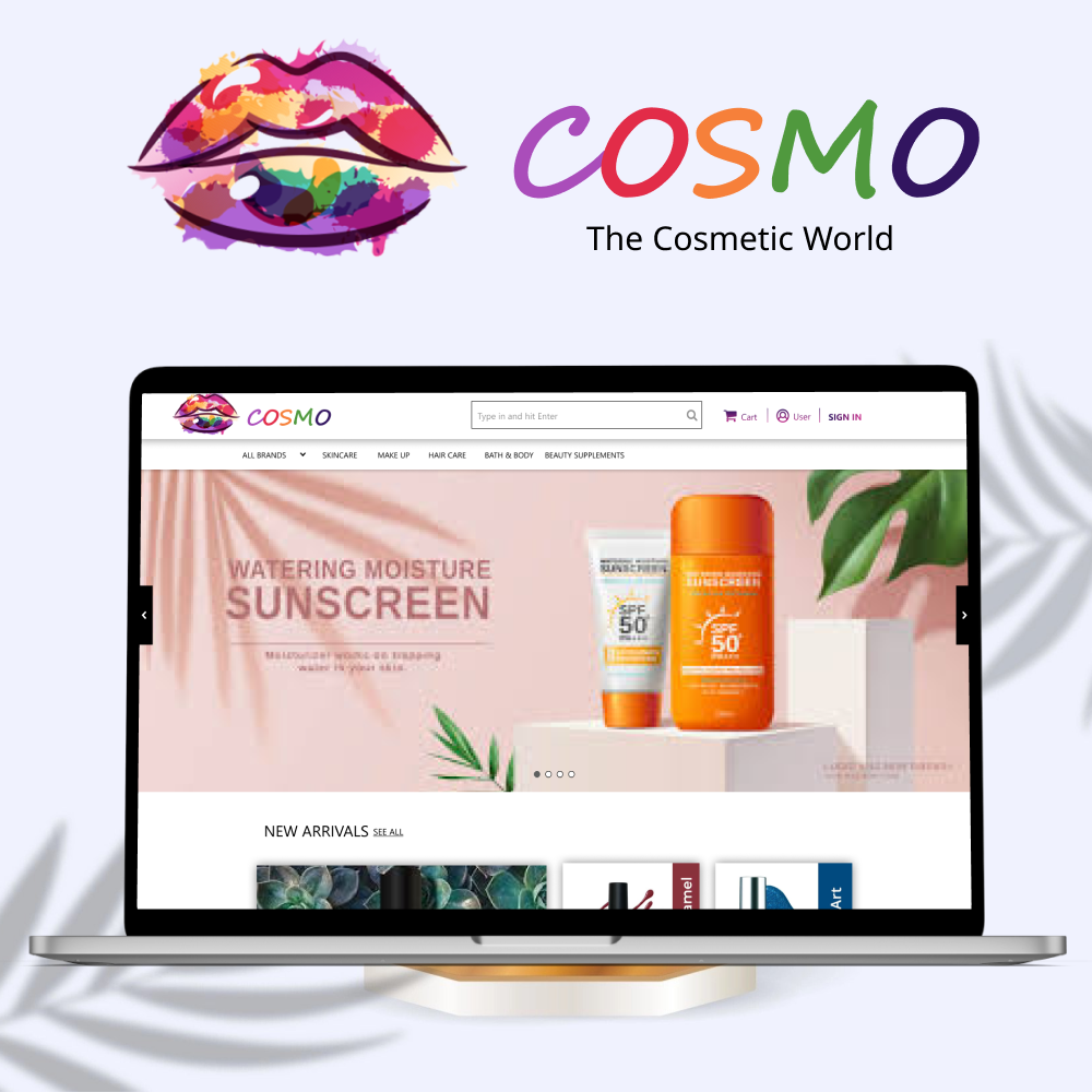
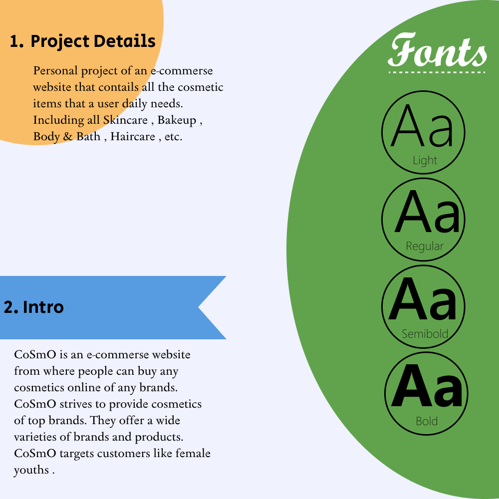
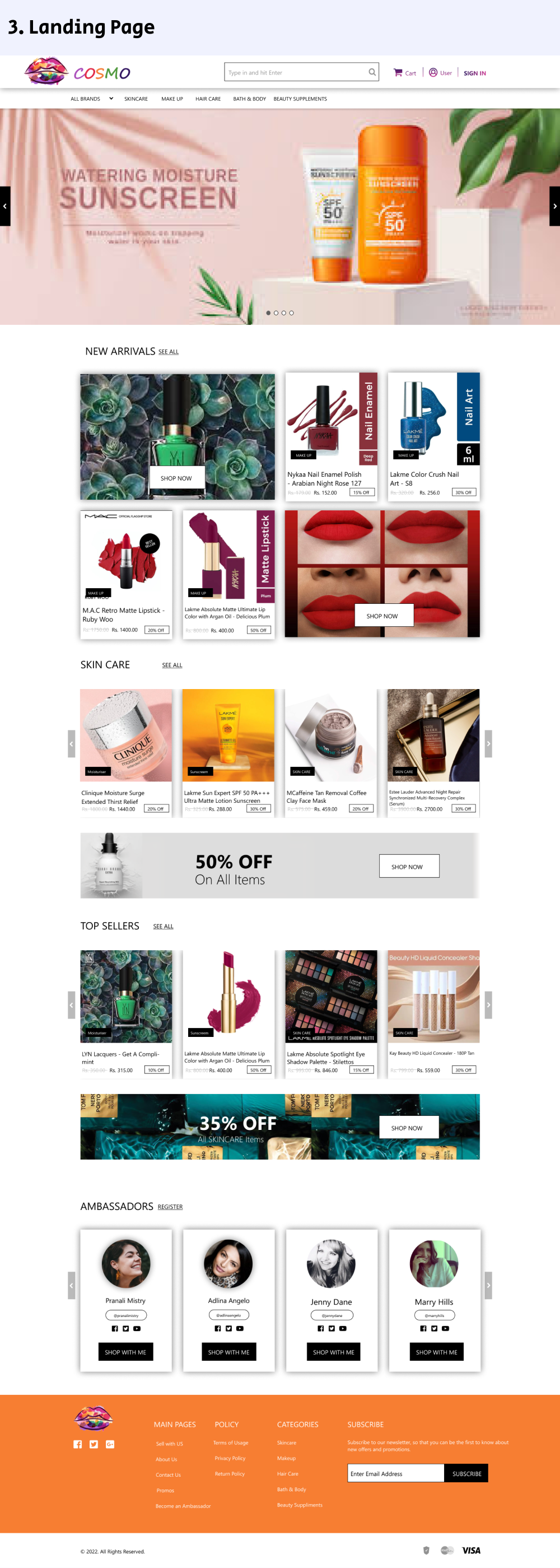
Personal project of an e-commerse website that contails all the cosmetic items that a user daily needs. Including all Skincare , Makeup , Body & Bath , Haircare , etc.
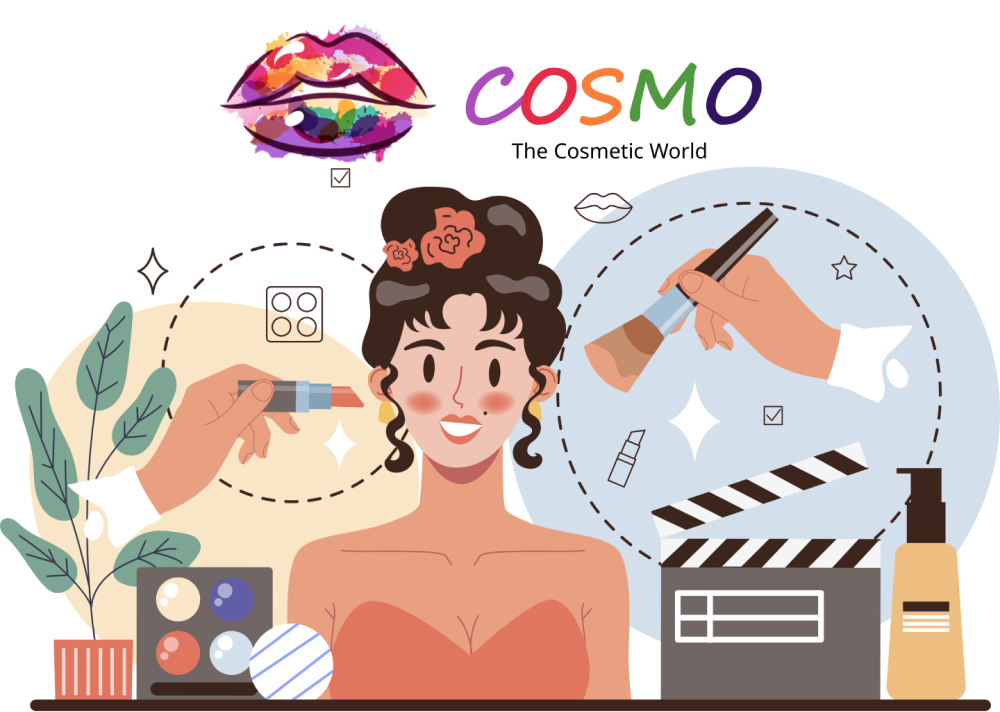
CoSmO
Objective
Cosmo is an e-commerce platform which is fully dadicated to cosmetics of different brands a one place.
The Goal
The goal of this project is to build an e-commerce website which will give the customers full assurance of the product's Quality.So that customers don't hezitate to buy the desired product for themselves.
The Problem
The word of cosmetic is dominated by top brands like Nayka, Lakme,etc. but they don't provide assurance of the product's Quality, they only sell their product on the customer's reviews.Now the problem is How we can impliment that assurance of Quality?
The Solution
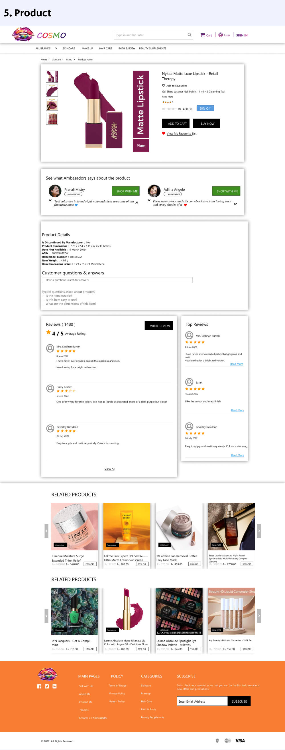
As a consumer we only belive experts who knows about the product.So this website has Ambassadors (these are those peoples who r experts in the cosmetic field),these people may be socialmedia influencers. They have to register themselves first then they will get to try some sample products. Then they will review them as an ambassador of the product on our website and their social media pages.This is one kind of Advertisement and quality assurance for the customers.
My Role
User Experience Strategist and Visual Designer for this new project. Developing all these tasks: Planning, User Research, Wireframing, Usability Tests , User Journey Map and High-fidelity Prototype .
The UX process
1 - Check Cosmetic Website
Lots of e-commerce and cosmetic websites are available in the market and we have to standout among them and attract customers to our website.
2 - User Research
I conducted interviews and created empathy maps to understand the users I’m designing for and their needs. Mostly women are the primary targeted Users.Men are also frequest Users but womens are the center of focus.
This interviews confirmed initial assumptions about Cosmo customers, but research also revealed that the product which looks good sells faster. Hence the presentation and arrangement of products according to review and quality should be attractive.
3 - Usability study: findings
Findings from the firs study helped guide the designs from wireframes to mockups and the study used a high-fidelity prototype and revealed what aspects of the mockups needed refining.
Findings
1. Users want to navigate through multiple brands quickly
2. Users want product related to specific catagories
3. Users want product suggessions
4. Users want multiple offers
5. The moockups are too much clumsy and bright
6. Ambassadors registration is confusing
4 - Accessibility considerations
1. Provided access to users who are vision impaired through adding large text to images for screen readers.
2. Used buttons to help make navigation easier.
3. Used detailed imagery for cosmetics to help all users better understand the designs.
5 - Takeaways
Impact:
The website makes users feel like Cosmo is really minimalistic, clean , easy to understand, navigate and made cosmetic shopping enjoyable with multiple offers and suggessions.
One quote from peer feedback: “The website made it so easy and fun to order and try different cosmetics and give reviews by becoming an ambassador. I would definitely use this website as a go-to for all my cosmetic needs.”
What I learned:
While designing Cosmo, I learned that following every step of Ux is most importannt if we skip one we have to face a lot editing our screens. Usability studies and peer feedback are key to make the product user friendly.